Our Brand Identity
We are very much committed to the future and success; we believe our actions, thoughts and techniques can change the world.
![]()
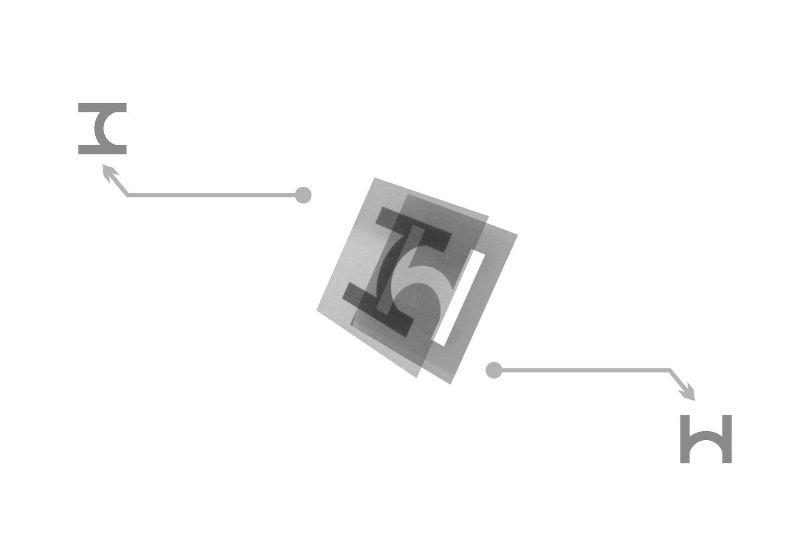
We have structured our Brand Appearance according to the dichotomy of the following design principles: Inside and Outside, Domestic and Global, Present and Ancient, Japanese and Linga Franca.

H is the first initial of "HARE", a word taken from Sanskrit, to mean to get rid of suffering. Hare also means “sunny” in Japanese. We combined the “H” in two different orientations to create a special H x H symbol: a very simple symbol –but it’s perfectly ideal, because what really counts is the spirit behind it.
Contact us
Please fill out the information below.